Wednesday 27 October 2010

Typing Type can be Typographical....

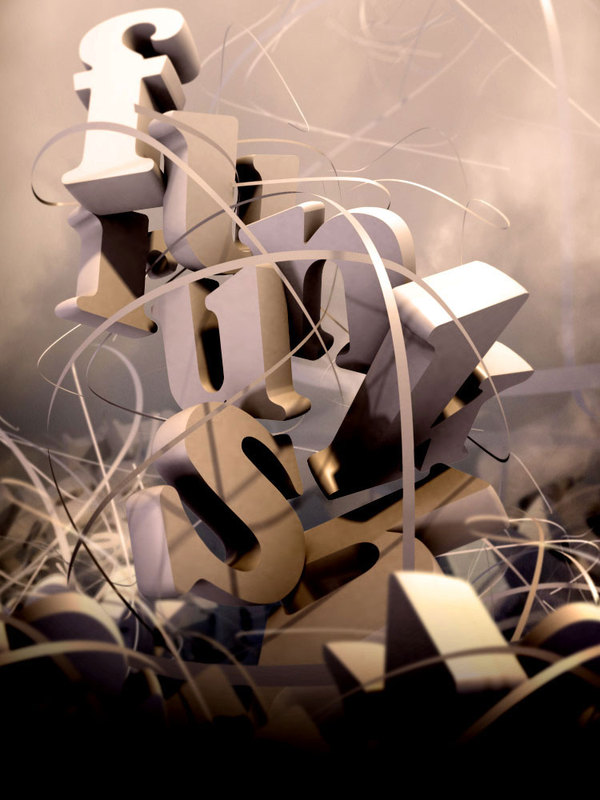
A friend said to me the other day that she understood how important the “font” was and that as soon as this “font” was captured everything would fall into place. I giggled to myself at her use of words, as I realised that since studying graphic design over the last 3 years I have realised how imperatively important and essential TYPOGRAPHY is within design. Once you realise its eminence, you can’t get away from it, you see that it is everywhere around us and its what makes us go “wow!” in design. Designers use type to create inspirational designs and use it as a means to communicate their ideas through their work. Using type in the correct way is very hard, and something I have always struggled with, but it is a fascinating element of design and typographical inspiration can be a great resource for designers.


Packing A Punch....

I have been researching packaging design for my dissertation, what makes the consumer stop and look at the product, absorb it and take it in, what little details makes the consumer make THE decision at point of purchase?

People always say “Don’t judge a book by it’s cover.” I definitely do this, but to be honest in a world where there are thousands of competitors for every single product, I don’y have the time or the money to try all these various products, so I admit, I do “judge a product by its cover!”

I am looking into how packaging design has changed from a means of transporting and protecting goods to advertising and selling them. Surveys have shown that many consumers see the product for the first time on the shelf and therefore the package design is the most important advert for the product and therefore the brand.

Products needs to stand out from their competitors, and throughout history although designs have changed and transformed with trends, they have done this in much the same way, using simplicity, unusual shapes and forms, colours relative to the product and consumer, type and creativity.

While many products use one or more of these aspects of these, many just use one, and with that one they make such a strong impact that it holds it own. The problem is in order to design the best possible packaging, one needs to know which ONE to use. This can be found through research, and research is key for packaging design success.

Here are a few that caught my attention and have been a success within the consumer market.


Monday 11 October 2010

Typography Of The World


A week or two ago, London-based graphic designer Ben Terrett, of Noisy Decent Graphics, asked his readers this question:
“What typographic advice would you give a third year design student?”
I feel that the type within my work I have produced so far is always weak. I don’t spend enough time analysing what looks good what sounds good and what fits correctly with the piece of work I am producing. I found a few typography tips, to keep look back over when I am working on my briefs.
“Don’t underestimate its importance. The best ideas, the most beautiful imagery, the most harmonious colour combinations will be blighted by inferior typography. So work at it, study it.” - RICHARD WESTON of
ACE JET 170
“As always, make sure you play with silly ideas on paper too, they get the creative juice flowing.”— FERNANDO LINS
I feel that the importance to put pen to paper is not stressed enough and many graphic designers have all these fabulous ideas up in their head but never put them down on paper, therefore don’t fully unveil what these ideas could potentially evolve in to.

I found this screen shot from the title sequence of “Catch Me If You Can”. The way the type is used in this works perfectly with the film, and is incorporated perfectly into the opening credits.
I then went on to discover that Flickr had hundreds of inspiring ‘Typography’ groups for young designers to feast their eyes on. Amassed the groups contain over 50,000 images! I found one group called “Typography of the World”, which caught my attention. Some of the shots are really stunning and make you realise how important type is throughout the world. Not only does it convey an obvious message but it stands for something alone and can convey a brand, an emotion or a feeling, from the shapes and silhouettes it forms.